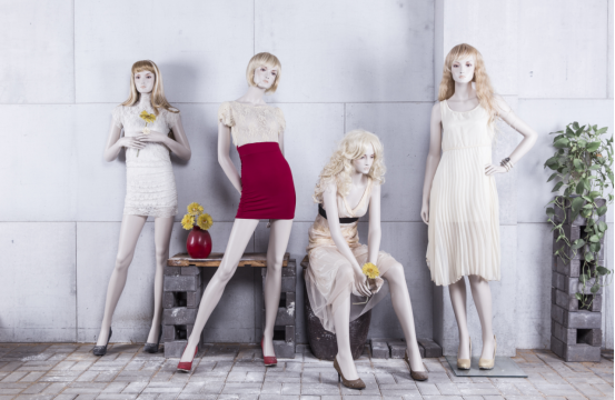
1. Lessen the quantity of items on display
The adage "the rare thing is precious" holds true forever and may be applied to retail displays as well.
We just need to place one or two of each kind of product in our display, which may convey both scarcity and diversity. It will be simpler for people to "cherish" if there are "less" items.
A business that has an excessive amount of merchandise displayed may appear extremely "crowded," give the impression that the merchandise is inexpensive, and cannot be sold since it is stacked high in the store.

2. Diminish the product's hue
People won't make decisions when there are too many options. Most people's psychological states are like this.
To help clients make decisions, we can categorize the items in the shop based on color if there are an excessive number of hues available.
With the rise of minimalist designs, an excessive amount of color would simply confuse buyers and remove all sense of beauty.
In general, a display surface's or module's color should be kept to a maximum of three colors.
3. The exhibit is tidy
The simplest aspect of a store is that it must be neat and organized. It's not necessary for the business to be upscale, but it must be tastefully decorated.
Look at this little shop with items. A well-organized display may serve as a reflection of the store's goals, save clients time throughout the purchasing process, and enhance their overall shopping experience.


