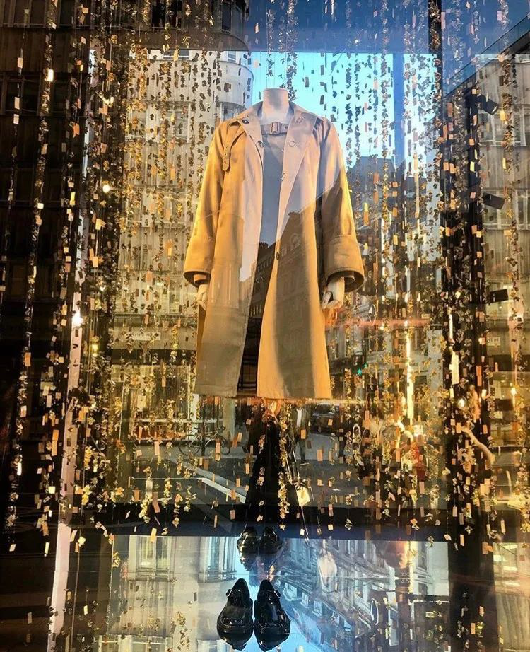
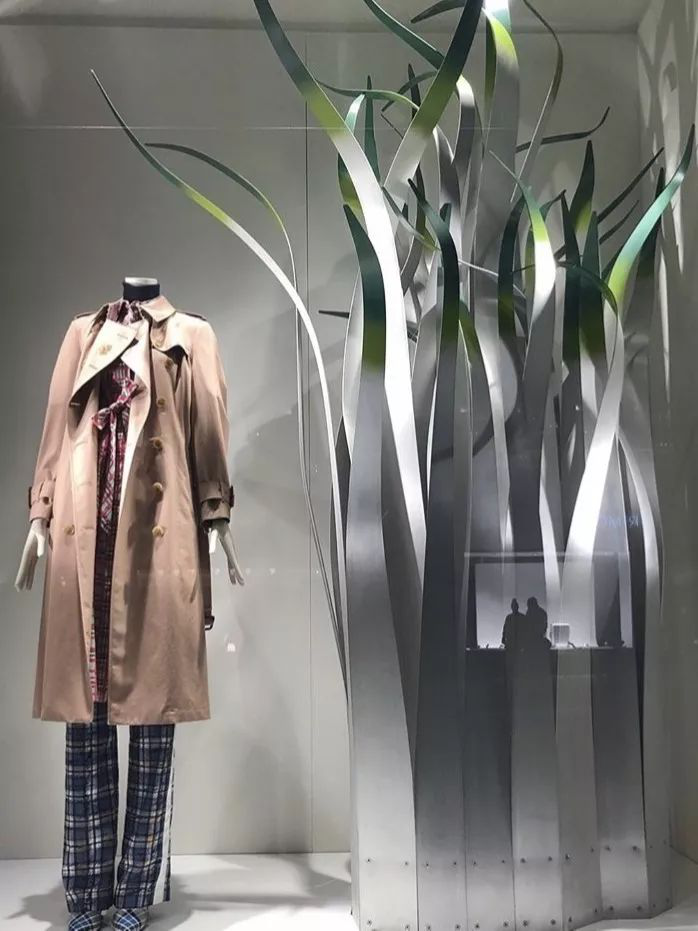
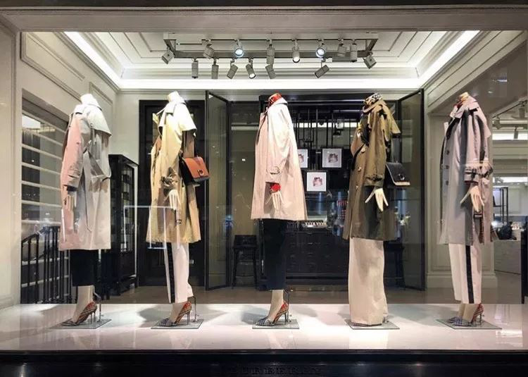
Use a beige, white, and light-toned background so that people's vision becomes clean and it's easier to see the clothes in the window. Moreover, most of the autumn windbreakers are beige, and the background of the lighter shades can be unobtrusive, echoing the windbreaker, and at the same time creating a warm feeling of autumn.

As far as possible, a windbreaker is placed in a single window, and when people pass by the window, they will be concentrated on the product in the middle position.
1) Use a beige, light yellow background to echo the beige windbreaker and create a feeling of autumn.
2) Reduce the decoration and props around the product to make the windbreaker more conspicuous.
3) Create a beauty of balance
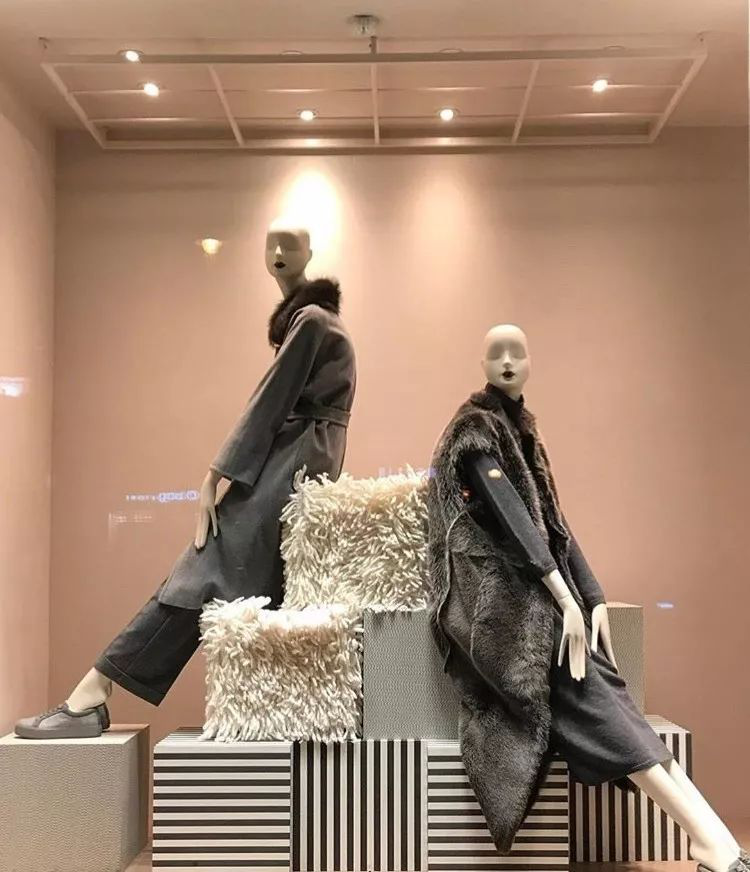
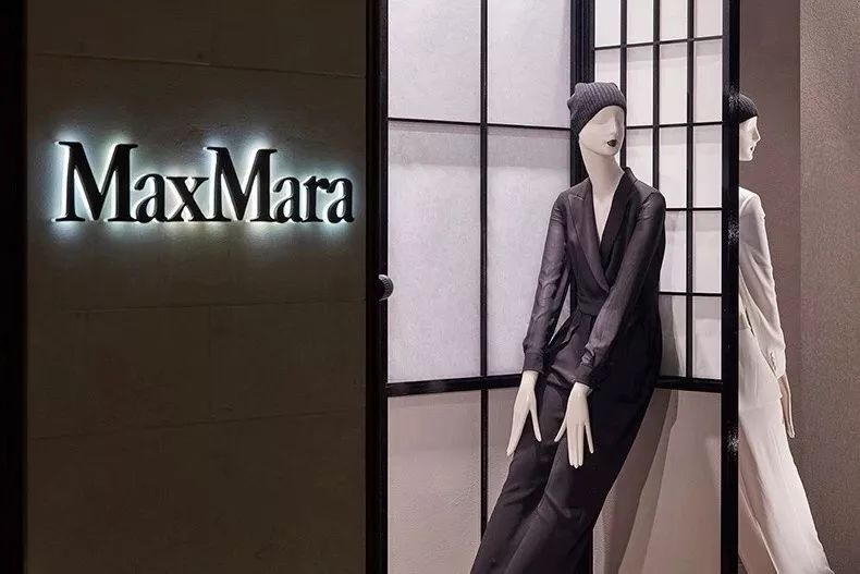
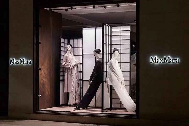
 MaxMara is simply a sensational aesthetic fanatic in the window! In almost every window, it puts the model in the center, and with its elegant color, the entire window exudes an elegant feeling.
 1) Form a model or product in the entire window to create a central symmetry, to create a balance of beauty, in line with people's line of habits.
2)The axis of symmetry is not necessarily at 1/2 position, but also at 1/3 position, which is in line with people's focus.3. Rational use of models
3) Rational use of models

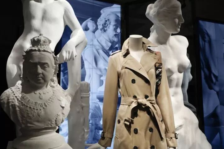
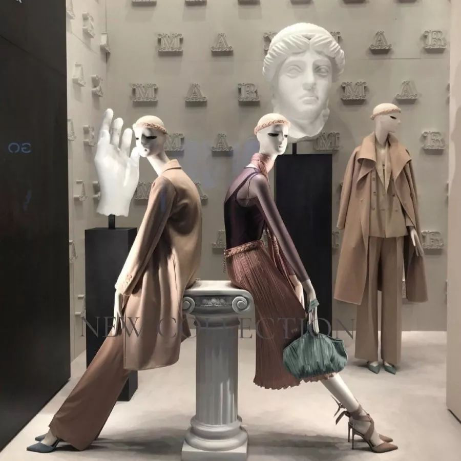
In the window, the model's posture does not have to stand in a windbreaker, or sit in a windbreaker.Models can be placed on the front, side and back so that the various angles and details of the windbreaker can be displayed in a window, including the design of the back of the trench coat, the design of the button, the design of the corner, etc.

Use models, different angles, different heights, different postures (sitting, standing) to show the look, texture, etc. of the windbreaker
