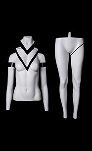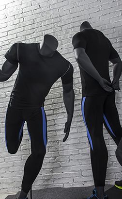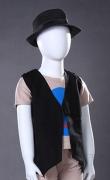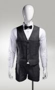
When it comes to the first impression that a clothing store gives people, it is none other than the mannequin decoration in the storefront. A good positioning of the mannequin can make the display window visually more beautiful, active, and provide a better sense of scene and reality, bringing a strong visual impact to people.
When displaying in the shop window, it is common to encounter the problem of mannequin placement. How should a mannequin be placed to look good? Let's analyze the positioning with different numbers of models.

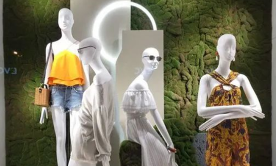
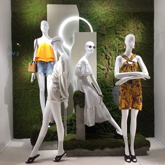
The four mannequins can be positioned in the middle, back, front, and middle positions, forming an "N" shape or a mirrored N shape, with the adjacent three mannequins still arranged in a triangular pattern.
It can also be divided into two groups, in the form of 1+3, or two at the front and two at the back, arranged on both sides in an isosceles trapezoidal arrangement, which is commonly seen in the display of casual wear.
The positioning is adjusted in a triangular shape before and after, but there are certain requirements for the depth of the display window. To create a sense of hierarchy, the depth of the display window must be sufficient.

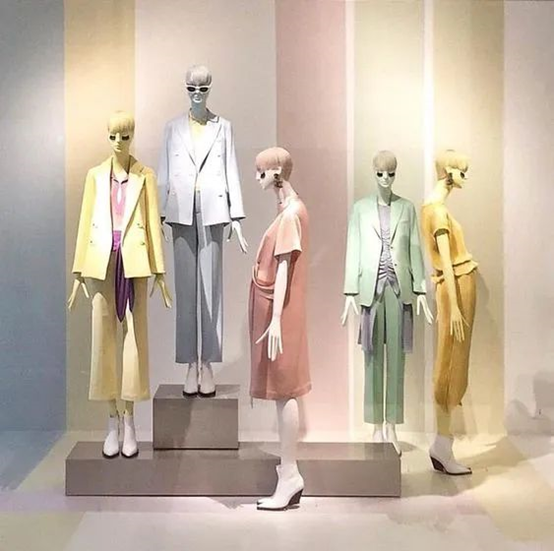
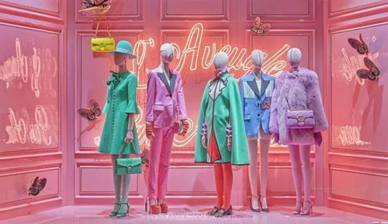
Five mannequins can also be grouped, namely mid, front, back, front, and middle, with the adjacent three models still arranged in a triangular pattern.
The five mannequins can also be divided into two groups, in the form of 3+2, namely median, front, back, front, and median, with the adjacent three models still arranged in a triangular pattern.
The vast majority of shop window mannequins are suitable for a "triangular" position. If the mannequins are not grouped, they are arranged in a staggered "front, middle, and back" manner. However, when the mannequins need to be distributed in two groups, such as 2+1 or 3+1, there will be an imbalance in weight. So individual mannequins need props next to each other to balance the weight ratio at both ends of the showcase, and in the absence of props, try not to group them.
