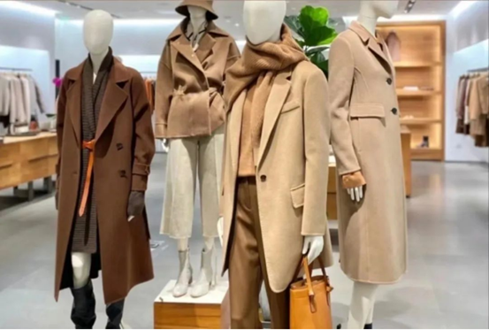
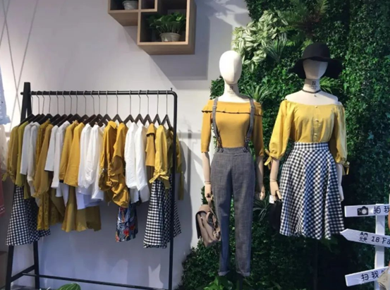
In a clothing store, the most important thing is always the display. So what is the most important factor in display?
Of course it’s color!

When a customer walks into a store, the first thing he or she sees is color, which is the most eye-catching content.
If a customer walks into a clothing store and sees a colorful mess, doesn’t he look like he has a headache? Will you still go into the store and take a closer look?
To learn clothing color display and matching skills, first of all, we must understand that the purpose of doing so is to beautify the shopping environment, stimulate sales, and facilitate purchase.
1) Gradient type
You can simply combine products of the same color with different shades to look layered. For example: color from light to dark, white - beige - rice coffee - light coffee - dark coffee.
2) jumping type
Also known as the piano key type, it is more suitable for displaying products in a series. The combination of different colors, through the interval method of dark-light-dark-light, has a strong sense of jumping and a full visual experience, which increases the vitality and vitality of the store.

3) Rainbow style
It is suitable for brands with more colors, lively and young styles. Stores with rich product colors can display products according to rainbow color combinations.

