Catch the attention of customers,
First of all, we must improve the attractiveness of the store front.
The first thing customers see is the store front, so the first thing to do is to design an attractive front door. Because 90% of the way people get information comes from vision, and the most effective visual is window mannequins, colors and shapes.

一.Choose mannequins that match the clothing or the scene.
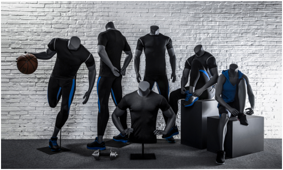
For example, if you want to show sportswear, then you should choose some sports mannequins with dynamic effects to show the dynamic effect of the clothing and make the clothing more vivid.
If you are a commodity store, you can still use mannequins to create more vivid display windows with scene stories to attract the attention of passing customers.
Mannequins have always been the most commonly used and advantageous display props in shop windows. AFELLOW mannequins are the most complete, with thousands of styles to choose from, which can be customized.
二.Choose the brand's VI color
When people see a color, they think of a specific brand, for example, when they see lake blue, they think of Tiffany.
When you see orange, you will think of LV. After all, Hermes orange is the color that has always made women crazy~
1. Use bright colors
Humans are all "color-loving animals", and the brighter the color, the more attractive it is to people.
Especially this kind of spreading a color on a large area will also create a sense of shock visually, making people unable to stop and stop.
3. Choose Different Colors
Today's physical stores, regardless of the products they sell or store design, have serious homogeneity, which is easy to cause consumers to have aesthetic fatigue.
But a smart shop owner knows to "change the color" of the shop and make some changes.
At the front of the store, choose a color that is differentiated from the store next to it, so that it has a high degree of recognition on the street with a uniform color tone. The right color can instantly catch the eye, and the right shape can be deeply rooted in the hearts of the people.
三.The shape selection of the store door starts from these three points:
1. Choose according to the shape of the VI
Take the simplest example: a big yellow M that customers can see from a distance and know it's McDonald's.
When you see a tick, you know it's Nike. These door header designs are closely linked with the brand VI, leaving a deep impression on customers.
2. Choose according to local cultural characteristics
For example: Starbucks, in different places, it will set up the door and the store environment according to the local cultural characteristics.
The Starbucks in the Sinan Mansion in Shanghai has a strong republican style in its overall design, which looks full of charm.
The Starbucks in Disneyland looks very Disney-style. It is different from the usual Starbucks storefronts, but it gives people a more novel feeling.
3. Make the shape according to the main item For example, a bakery shop can put the shape of the cake on the door to make it eye-catching and let everyone know that this is a bakery. And milk tea shops or other shops can also use this method.
Nowadays, the development of e-commerce is getting better and better, and the business of physical stores is getting worse. If the store does not have the ability to attract customers into the store, then you can only be eliminated by the times.
But some physical stores can double their sales during this period. Why?
Because they have enough customers, and they are still trying their best to attract more customers, only when customers enter the store will they make purchases.


