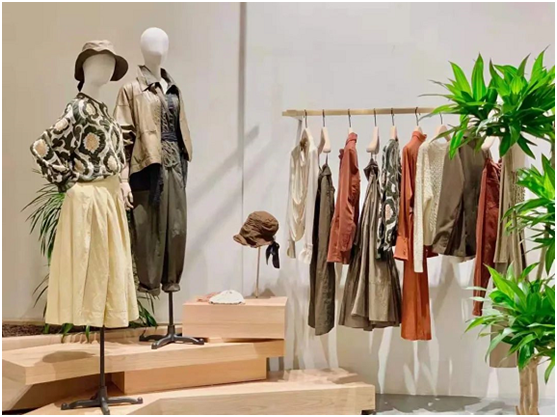
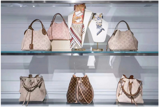
1. Reduce the number of products displayed
"Things are rare as precious", which is also applicable in store display.
In our display, we only need to put out one or two of each type of goods, which can reflect both diversity and scarcity. "Less" goods will make it easier for people to "cherish".
Excessive display of goods will make the store look very "crowded", and will create the impression of "the goods are not good, can not be sold, piled up in the store", and the sense of cheapness is very obvious. To
The smaller the shop area, the more likely it is to have this problem.

2. Reduce the color of the product
When there are too many choices, people will not make any choices. This is the psychological state of most people.
If there are too many colors in the store, we can classify the products according to the colors to make it easier for customers to choose.
With the emergence of minimalist styles, too many colors will only make customers feel dazzled and experience no trace of beauty.
Generally speaking, the color of a display surface or a module should be controlled at about 3 colors.

3. The display is neat
Clean and tidy, this is the most basic detail of a shop. The store does not need to be high-end, but it must be neatly displayed.
Take a look at this small item store. The neat display can reflect the intentions of the store, and also help save customers time when they buy, and bring customers a good shopping experience.


