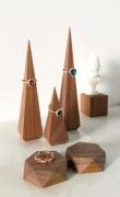
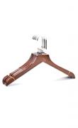
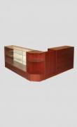
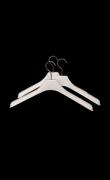
Color scheme
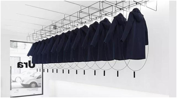
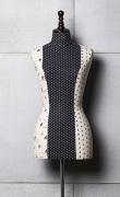
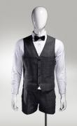
The minimalist style is not limited to black, white and gray. A large area of other solid-color backgrounds can also make the screen look simple, emphasize products and highlight themes.
Minimalist style usually uses neutral tones with low saturation, and remember to use only one color or a color scheme of the same color as possible.
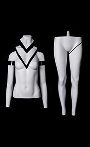
The combination of a solid color background and lighting, and the use of high-contrast colors to frame the product can also have a good eye-catching effect.
Element
The most commonly used element of minimalist style is lines, which show various shapes with simple and powerful lines. It will not be too jumpy and bring out the product at the same time. It can not only be used to create intervals and patterns, but also create a stronger sense of space. Lines can give people a very smooth line of sight, making it easier to get attention
Props
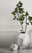
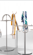
When there is a product in the window, it must be the protagonist, and it can't steal its limelight at any time, so the props should also be subtracted accordingly, and the same elements can't appear too much.
