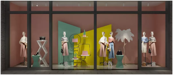
Hermes, who has always loved colorful colors, also played low saturation color matching. The low-saturation pink and green pairing is not abrupt at all, and it also weakens the visual impact and looks much softer.
When creating a sense of the scene, low-saturation colors can make the colors better blend together, and will not be messy because of the many colors. Using a single color as the background color, coupled with a triangular composition, looks more harmonious and stable.
The store below uses low-saturation pink as the background color, embellished with low-saturation green and yellow. The collision between colors brings just the right visual impact and is full of youthful vitality.

If the decoration style of the store has been fixed, you can place the light color system in the position of the water table to increase the blank area, so as to form a contrast with the dark color system in the front light and dark in the back, creating a sense of expansion and expansion visually Store area.
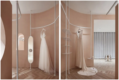
This bridal shop uses nude pink as the keynote, interspersed with curtains, white shelves, and ceilings as blank spaces in the space. The overall feeling is not too sweet and greasy. It is matched with marble to enhance the texture, and it is beautiful and romantic. It is fully in line with countless girls Longing for the wedding dress.


