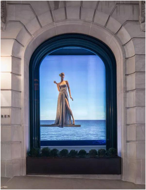
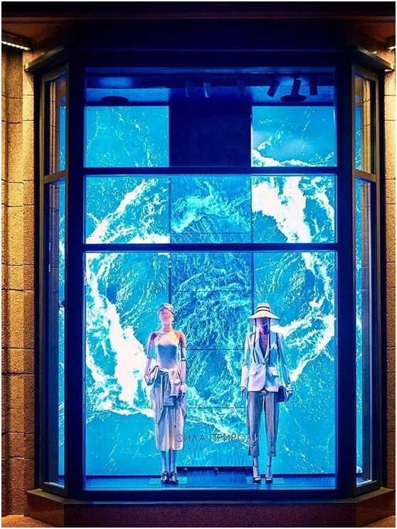
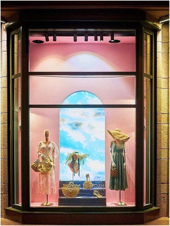
Speaking of summer, I think no one will think of the ocean. The "ocean" scene can be said to be a classic of the summer window.
Cool vision, holiday atmosphere.


But this summer, we can use "ocean" more simply.
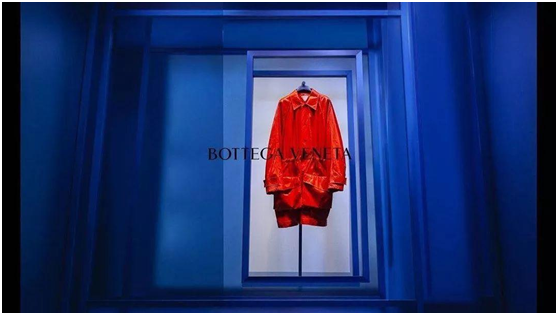
For example, like BV, only the ocean blue is used as the background, leaving a white piece to highlight the product.

As long as some space is designed, the window will not be monotonous. The contrast between the color of the product and the background creates a visual impact, and the product can be emphasized again.
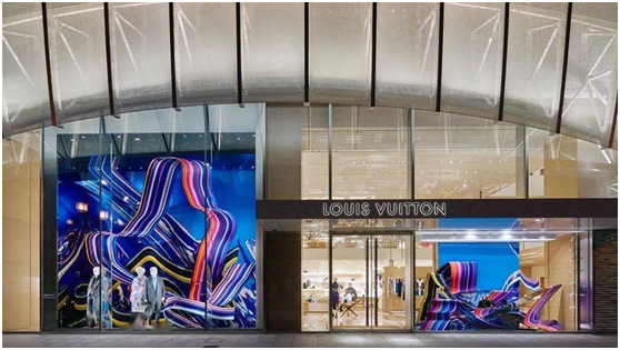
Another example is that like LV, ocean blue is still used as the background, and exaggerated large props are used as highlights. The colorful and fluttering lines are like the water patterns of the deep sea, romantic and sentimental.

This stripe has a sense of ribbon when viewed up close.
Ralph Lauren uses the sea as the background, and adds one or two dark blue vases to decorate. The whole window is cool and simple, full of European-style artistic atmosphere.
